Last updated on:
Curious what a Customer Experience Dashboard is and how it can help your business in reducing churn? You’re in the right place. This article explains it all in simple terms.
In today’s competitive world, offering a great customer experience (CX) isn’t just nice to have – it’s a key driver of growth. Companies that focus on CX grow more than twice as fast as their competitors. They understand how customers feel and fix problems before they turn into churn.
However, customers interact with your brand in many ways — on your website, mobile app, in-store, through deliveries, and via support teams. As a result, CX data often ends up scattered across different places.
A Customer Experience Dashboard brings everything together in one clear view. It shows customer feedback and key metrics in real time, helping you take quick action and improve satisfaction.

In this post, we’ll look at what a CX dashboard is, why it’s important, and how you can build one that truly helps your business grow.
Table of contents:
TL;DR
- A Customer Experience (CX) Dashboard centralizes customer feedback and sentiment data in one place using visual representations like charts and graphs, helping brands track key CX metrics like NPS, CSAT, CES, and more in real time.
- It enables teams to identify churn risks early, spot trends, and make improvements to increase customer satisfaction.
- A great CX dashboard is real-time, intuitive, integratable, and customizable, offering drill-down insights and company-wide visibility.
- Building one involves defining key metrics, ensuring clean data flow, designing reports, syncing with tools, and driving adoption.
- Affiniv simplifies this entire process – from collecting customer feedback to visualizing insights and taking automated actions – all without the need to code.
What is a Customer Experience Dashboard?
A Customer Experience Dashboard is a visual tool that shows all your CX data in one place. It gives you a real-time view of how customers feel about your brand.
A well-designed CX dashboard turns data into actionable insights, helping you boost customer satisfaction and loyalty. It uses reports, graphs, and charts that make patterns easy to spot. Some dashboards even let you set alerts and workflows, so you can respond quickly when something needs attention.
You can use a CX dashboard to:
Track key CX metrics
Identify trends in customer feedback
Spot problem areas before they affect retention
Automate alerts and workflows
Act fast to delight your customers
Here are some of the most common CX metrics you’ll find on a CX dashboard:
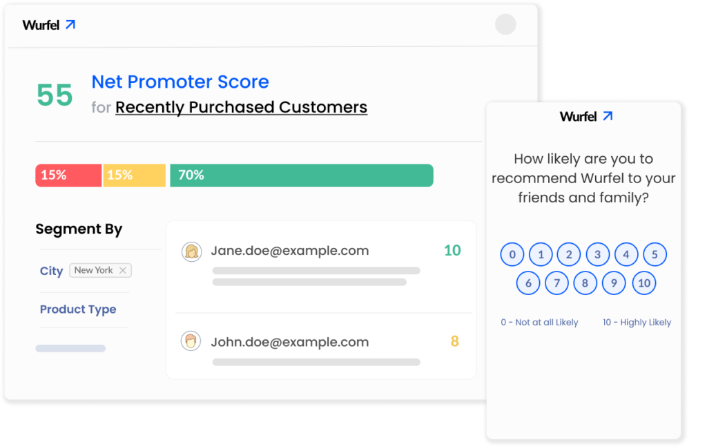
Net Promoter Score (NPS): Measures brand loyalty by asking how likely customers are to recommend you.
Customer Satisfaction (CSAT): Tracks short-term satisfaction after an interaction or purchase.
Customer Effort Score (CES): Shows how easy it is for customers to complete a task or use your product.
Voice of the Customer (VoC): Captures insights from open-ended customer feedback.
Other Engagement Metrics
Importance of a Customer Experience Dashboard
A customer experience dashboard is your source of truth for understanding how customers feel about your business. When designed and used well, it can help you reduce churn, increase loyalty, and drive faster revenue growth.
A Unified View for the Whole Company
Customer experience isn’t owned by one team alone. Product, engineering, marketing, category, and support – every function plays a part in shaping how customers feel. A CX dashboard brings all this data together, acting as a Voice of the Customer (VoC) platform for the entire organization. Everyone gets a shared view of what’s working and what’s not.
Prevent Customer Churn with Real-Time Insights
Bill Gates once said, “Your most unhappy customers are your greatest source of learning.” Leading brands take that seriously and act fast. A CX dashboard helps you get feedback the moment it is provided – enabling you to turn unhappy customers into delighted ones before they churn.
Continuous Improvements to Boost Growth
A CX dashboard doesn’t just show surface-level metrics. It helps you dig deeper to uncover the root causes behind customer sentiment.
For example, a deep dive into NPS might reveal that customers in Texas have the lowest scores, and 80% of detractors there report poor delivery experiences. With that insight, your logistics team can take targeted action, improving both customer satisfaction and loyalty.
By giving every department a unified, real-time view of customer data, your business can spot process gaps faster and turn them into opportunities for innovation and growth.
Key Features of a Good CX Dashboard
As we discussed earlier, a customer experience dashboard is used by multiple teams across a company. That’s why it’s important to design it in a way that truly empowers teams, rather than existing as a “check-the-box” tool. Below are the key features that make a CX dashboard effective and impactful.
Real-Time Data Sync
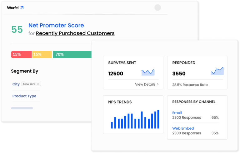
A great CX dashboard updates automatically, so decisions are always based on the latest insights. Depending on business needs, teams might use it several times a day or just a few times a week – but the data should always be up to date. Real-time syncing ensures that reports and metrics reflect what’s happening right now.
Deep Drill-Down Capability
The goal of a CX dashboard is not just to show metrics but to help you understand why those numbers move. It should let you explore reports in detail to uncover root causes.
For instance, imagine a Customer Success Manager investigating a drop in CSAT for support interactions. She might want to see:
- CSAT by support agent
CSAT by channel (Email, Chat, Call)
CSAT by issue type (Delayed delivery, Returns, etc.)
If she spots that one agent is driving the decline, she can drill down further to find the reason – all within the same dashboard. A good CX dashboard makes this level of analysis fast and easy. It also allows exporting of reports and data.
Intuitive & Fast
Being easy to use is crucial for a customer experience dashboard. It should intuitively provide all reports and load fast. No endless clicking, no endless waiting. When teams can quickly find what they need, adoption increases, and insights turn into action faster.
Integratable with Everyday Tools
A customer experience dashboard shouldn’t merely be a stand-alone analytics dashboard. It should integrate seamlessly with your existing systems – like CRMs, helpdesks, communication tools, and databases. This keeps feedback loops tight and ensures that insights translate into action in real time.
Modern Customer Experience Platforms, such as Affiniv, even provide AI-generated insights and alerts, helping teams save time on analysis and focus on what matters most – improving customer happiness.
Create your free account now to explore.
Customizable
Business priorities evolve, and your dashboard should evolve with them. A strong CX dashboard lets you easily add or remove metrics and reports, and set role-based access for different teams. That flexibility keeps your analytics aligned with your company’s changing goals.
How to Build a Customer Experience Dashboard
Now that you know what a good customer experience dashboard looks like and why it matters, let’s walk through a simple step-by-step process to create one for your business.
Step 1: Define The Right Metrics
Start by defining your CX goals. A good dashboard isn’t about tracking everything – it’s about tracking what truly matters.
The three foundational metrics to include are:
Net Promoter Score (NPS)
Customer Satisfaction (CSAT)
Customer Effort Score (CES)
You can also add post-purchase survey data, review/feedback sentiment, and support SLAs for a complete picture.
Tip: Involve cross-functional stakeholders (marketing, product, support, category, operations) to decide which KPIs align best with your CX goals.
Step 2: Ensure Reliable Data Flow
Your dashboard is only as accurate as the data that powers it. Make sure your systems are set up to collect, store, and sync the right data automatically.
For instance, to measure NPS effectively, customers should receive surveys at the right time and through their preferred channel. The responses must also be recorded correctly.
If you’re building a custom dashboard, you’ll likely pull data from:
Support tools: Zendesk, Gladly, Freshdesk, etc.
CRMs: HubSpot, Salesforce, etc.
E-commerce or app data: Shopify, web analytics, etc.
Survey platforms: SurveyMonkey, Typeform, etc.
Establish reliable integrations or pipelines to keep your data fresh and validated (e.g., remove duplicates).
Tip: Use an end-to-end Customer Experience Platform like Affiniv to skip the setup hassles. You can launch branded surveys, collect feedback across multiple channels, and get a ready-to-use, customizable CX dashboard that doesn’t require coding. Affiniv also comes with existing easy-to-set-up integrations.
Book a Demo to learn more.
Step 3: Design Insightful Reports
Focus on reports that help teams make quick, informed decisions. Your dashboard should tell the full story – without overwhelming users. Here are some must-have reports:
- Overview report – A quick view of the overall CX health through survey scores (NPS, CSAT, CES), recent responses, and a summary of qualitative feedback. It may have the breakdown for important segments (like paid subscribers) upfront and/or quick filters.
- Trend report – Track score movement over time – weekly, monthly, or quarterly – to detect early drops or improvements.
- Segment-wise reports – Break down scores by segments like customer type, region, category, or channel to uncover what drives delight or dissatisfaction.
Step 4: Connect Data to a Dashboarding Tool
This is where your data turns into visuals. Once your data is clean and structured, connect it to a dashboard tool – either via direct integrations or APIs.
If you don’t have technical skills, use a customer experience platform. For example, the Affiniv CX dashboard has built-in real-time reports. It syncs survey responses, along with customer and transaction properties, directly from your systems – Zendesk, Shopify, etc.
Step 5: Drive Team Adoption
Even the best dashboard is useless if no one uses it. Some best practices to drive adoption are:
- Customize views based on teams/roles so that everyone sees relevant data.
- Schedule weekly reports for teams via email or Slack, giving a quick overview. Team members may log in to the dashboard if further action is needed.
- Set up real-time alerts for red flags.
Tip: Celebrate wins publicly – like “NPS up by 5 points this quarter!” – and encourage leaders to discuss dashboard insights in team meetings. This reinforces the importance of CX tracking across the company.
How Affiniv Helps Brands Build Powerful CX Dashboards
Affiniv is an all-in-one, no-code CX platform that helps you collect feedback, visualize it with an AI-powered dashboard, uncover actionable insights, and take quick action – all in one seamless workflow.
Six Reasons Why Brands Choose Affiniv CX Platform:
1. Create and Distribute Beautiful Surveys
With Affiniv, you can design custom-branded surveys using ready-made templates or build your own from scratch. Advanced logic flows ensure every question feels relevant to the customer journey.
Distribute surveys across multiple channels – email, SMS, WhatsApp, in-store devices, and web or in-app embeds – to reach customers wherever they are.
2. Automation Ensures Data Availability and Accuracy
Affiniv automates survey triggers based on customer actions like purchases, returns, or support interactions. It also sends automatic reminders to non-respondents, helping you maintain high response rates and consistent data quality.
With Affiniv, your data is always fresh, complete, and ready for analysis – no manual follow-ups required.
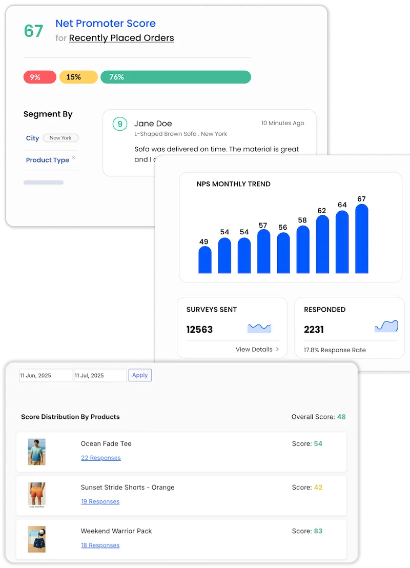
3. Readymade Dashboard with Built-in Reports
The Affiniv customer experience dashboard gives you real-time visibility into customer sentiment through intuitive reports and filters.
You can filter results by date range, customer attributes, order details, or response types to get the exact view you need. Every survey response includes customer and order data for context, and you can export everything as a CSV or push it to your own database via integrations.
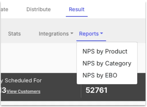
Beyond the overview, Affiniv offers deep-dive reports, like NPS by product or CSAT by agent, so you can pinpoint the “why” behind the numbers.
It provides an AI-generated sentiment analysis based on qualitative customer feedback. Further, each qualitative feedback is auto-tagged with keywords, and a keyword summary (with trends) is available to spot customer pain points instantly.

You’ll also see funnel stats for each survey and channel – from sent to delivered to responded.
The Affiniv CX dashboard even alerts key stakeholders to significant trend changes and their causes. This effectively puts the analytics on autopilot. Create your free account now to see it in action.
4. On-Demand Custom Reports
If you still find the need for more reports, Affiniv offers customized dashboards for enterprises to fulfill their specific analytic needs.
5. Easy to Use and Real-Time
Affiniv stands out for its ease of use, flexible customization options, proactive support, and affordability. The CX dashboard updates in real-time, so you never have to wait for an important update.
6. More Than Just a Dashboard
First, as highlighted above, Affiniv helps you generate accurate data through beautiful automated surveys.
Second, once you have all the data and insights handy, Affiniv empowers you to act quickly. With integrations like Shopify, Salesforce, Zendesk, Slack, and many more, you can not just set up survey triggers but also create post-response workflows.
For example:
Automatically create a support ticket for detractors.
Send negative feedback directly to a Slack channel for quick action.
Email a customer straight from the dashboard to acknowledge their feedback or share resolution updates.
Add team notes against specific responses for better internal follow-up.

Final Thoughts
A Customer Experience Dashboard isn’t just a reporting tool – it’s your command center for customer retention.
When built and used effectively, it connects data, insights, and action, helping you:
Detect churn risks early
Empower teams to act quickly
- Improve product, services, and processes
- Create a loyal customer base
By focusing on metrics like NPS, CSAT, and CES, ensuring clean data flow, and driving adoption across teams, brands can improve CX and reduce customer churn.
Tools like Affiniv make this process easier by letting you collect, visualize, and act on feedback from every customer touchpoint using a single platform that integrates with your systems.
Want to get started with your CX loop in minutes?